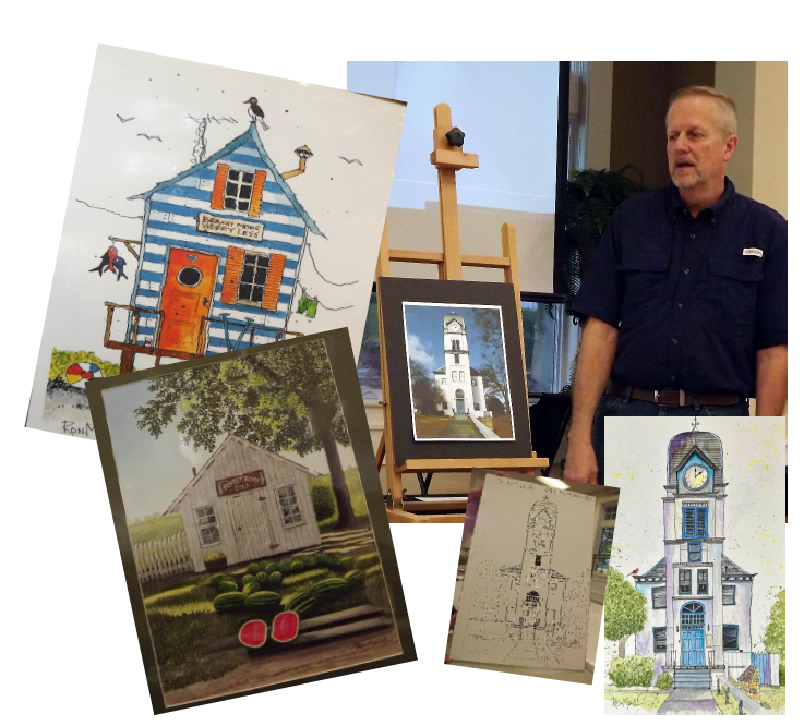
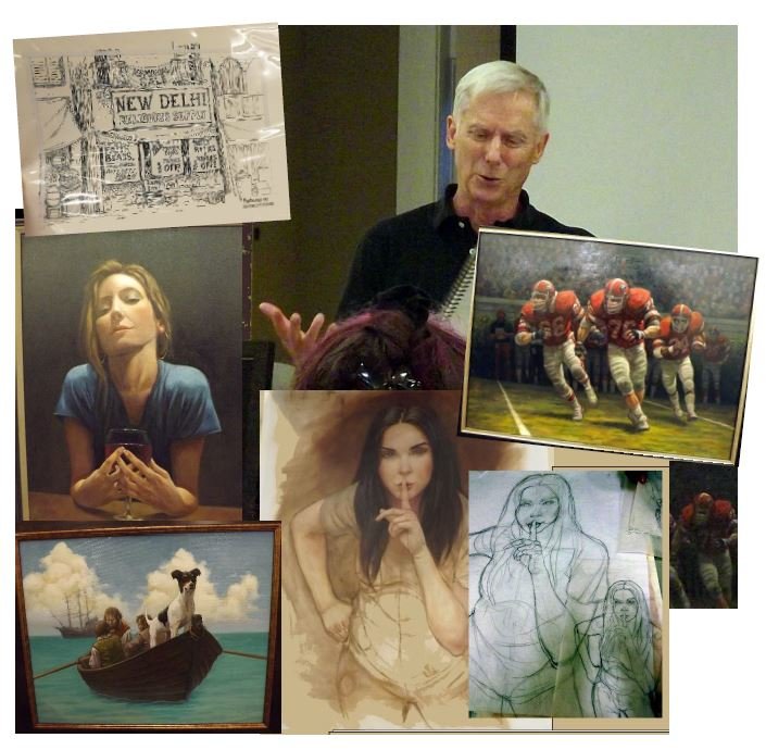
August 2023 Michael Montgomery, Illustrator to Studio Painter

Michael Montgomery started his artistic journey in illustration

July’s demo was presented by Michael Montgomery. Michael has a very lively talk about how he got into the world of art and eventually ended up creating fine art.

He decided to teach himself art because he didn’t get good feedback from his college professors at UGA. Michael is from Macon, Ga and started out working for “exposure” making buttons and graphics for water bottles. He learned to illustrate by going to the library.

Right after he married, he went to New York and went to Mad Magazine and was told that he needed to move to a city where illustrated art is purchased. So he and his wife relocated to New York where he hit the streets of Manhattan with his portfolio, hoping to land a job. The Tribune called and he was hired as a political cartoonist!

Newspapers at the time only registered black and white. It was very difficult to create the illustrations without making mistakes. Someone told him about a Blue pen called “Non repro blue” that the camera couldn’t see and suddenly drawing was SO easy! When Michael was producing political cartoons he never worked in color.

Michael moved back to Georgia with his family and began working for Ad agencies, illustrating books, etc. He said he never knew of anyone doing a small art piece and then blowing it up; it’s always the other way around. When you reduce a piece, the mistakes are also reduced.

He continued his education by using books and practicing- he has stacks of sketch books filled with anatomy drawings that he copied from books. He learned how to work in color from practicing what he was seeing in illustrators annuals but the learning was very slow.

Michael explained that the way illustration works is that there was a ‘stable’ of illustrators and the editors knew what each artist could do well and there wasn’t any crossover. If you did children’s book illustrations, no one asked if you could draw vehicles or portraits.

Michael enjoyed the work as an illustrator because you were given parameters (what was needed, how many pages, etc.) and a deadline so it was like a puzzle to solve. It was all business and they wanted to work with you to make money. An illustrator’s job was to make their wishes look good so that you’d get other jobs.

He moved from illustrations to artist because things like computers and Adobe Photoshop came along that made illustration much faster and cheaper. Progress has chipped away at traditional illustration by hand. Michael said he found it hard to come up with ideas as a studio artist. Coming up with the problem or idea was not his job before- he just had to make it happen.

As he transitioned to fine art, he found it harder because the artist makes all the decisions. So now, he asks his wife. Michael said he could easily start obsessing over something and end up stuck. Michael says he will paint from anything that works. The only thing that counts is the final product. He likes to print out he drawings big – at the size he plans to paint (he has a big printer) and then critiques it; making changes. He then reprints his final source image to start painting. Michael says he practices a lot and has over 70 sketchbooks full of drawings trying to get ideas down.

He works progressively from the bottom moving up the subject to the focus of interest area. Michael uses oils with Alkyd resin and Gamblin (Galkid) medium to mix with the oil to speed up drying time. He started out painting on illustration board because it was cheaper. The last thing in working a portrait is to put the highlights in the eyes.

He has done a lot of sports stuff for schools and some sell very well, while others don’t. It depends on who is doing the marketing for him. He has been doing commissions and painting in fine art for four years.

Michael does not teach but we all learned from his presentation that he has a wonderful way with telling a story!

July 2023 Jane Whitehurst, Expressionist Painter

Jane Whitehurst shares her expressionist paintings and method

Walking into a room filled with Jane Whitehurst's canvases can be mind boggling. They are huge squares and rectangles painted in eye-popping colors and abstract forms.

Jane is a California girl, born and raised there. As a child, she sat at the dining room table with her father and colored while he painted abstract forms and caricature faces.

As an adult, living in Houston, Texas, she attended the Glassell School of Art and served on the Board of the Museum of Fine Arts, Houston. She returned to California and got involved in interior design which she studied at California State University in Fresno. She was a commercial interior designer for many years while still maintaining an art studio. Jane also studied sculpture, which was her focus before she began concentrating on painting in 1994.

She considers herself an abstract expressionist. She believes this expresses who you are, and believes herself successful if the viewer can sense how she was feeling when looking at her paintings. She believes your response to a painting is important.

Jane uses a caulking gun to apply oil paint to her canvases, one gun for each color. To mix colors, she works with palette paper spread on a table in her studio. For marking and removing she uses a scraper.

Jane was asked if she knew what she was going to paint before she started. She said "no", she just makes a big mark on her canvas and sees where it takes her. She is very consistent - in her studio every day and plays music while she works. Shades of pink and pale greens are her favorite colors.

Her signature is integrated within the painting’s design. It takes her several days to complete a piece. When asked how she transports her large canvases, she replied "I rent a U-Haul". The canvases she purchases at Michael's.

Jane has a studio in Gay, GA., does commissions and displays in several galleries. Obviously, Jane Whitehurst has fun while she is painting! Special thanks to Barbara Kelly for the demo article and to Gwen Brown for the pictures.

June 2023 Andrea Boswell creates a Monster Mug and Platter

Andrea Boswell Creating a Monster Mug with ceramic teeth!

Our June demo was given by Andrea Faye Boswell in clay pottery. Andrea began the demo by showing us a Monster Mug that she had completed earlier in the day. In making a Monster Mug, Andrea said first you take a slab of clay (which she had already precut to save time) and round out the edges with a bit of water. Then use a tool to cut the edges of the clay at an angle so that the edges fit together when it was time to form a cylinder.

Andrea uses green board (the drywall used in bathrooms) to work the clay on. It sucks the water right out of the clay. Next the eyes are placed at about mid-range on the clay rectangle. Andrea cut out two pieces of clay to lay on top of the rectangle slab to form the eyes. Then she cut out two more pieces of clay of the same size to stack on top of the first two eyes so that the eyes would really pop out.

Andrea scores the back of the pieces so that they will adhere together in the kiln. Since this mug will be lower than the person holding it, the eyebrows will go up and the eyes will go up to ‘see people’. Andrea purchased a set of porcelain teeth like the dentists used to use and uses these for the teeth in the mugs. Since they are porcelain, they can go in the kiln.

After the eyes and eyebrows are in place, Andrea makes the mouth and adds the teeth. To make the mug drinkable, you must round out the edge outward to allow water to pour out (otherwise, it becomes a pencil holder!). Next Andrea makes a cylinder out of the rectangle piece with the face facing out. To add a base, Andrea takes another piece of clay and cuts out a round bottom using a needle tool and a scoring tool to shape and attach the pieces together. She uses a ribbon cutter on one end and a flat wood spatula to shape and pull up the base and smooth it out. Using the tools help to get the marks out of the clay.

To make the handle, Andrea squished some clay together making the clay into a roll over ½ inch thick. She also said that holes have to be put in the handle to allow the air to escape. After she shaped the clay and smoothed the ends, Andrea attached the handle to the mug at the top and bottom, smoothing out any marks.

Andrea doesn’t sign her work but marks it with a potters mark (stamp).

Next Andrea demonstrated how to make a platter. Andrea says you only put texture on the inside of the platter where everyone can see it and stamps and rollers with texture are used to make designs. After the texture is on the clay, Andrea drapes the piece over a form to give it the desired shape. She used a form for the platter. She likes to use a lazy-susan to work on with some kiln stands when using forms. Excess clay is trimmed off of the form by cutting with a tool straight in to make a nice edge.

Next, Andrea flipped over the piece and placed it inside the form to keep the shape and the stamped area is facing upwards. Finally, a sponge is used to soften the edges of the platter and then it’s ready to cure (dry).

There are no limitations when you make a free handed piece and she prefers using forms to a potter’s wheel. She uses a slab roller to control the thickness of the slab. Andrea uses a big hoop cheese cutter to cut slabs from the block of clay. Andrea said that clay has memory so it’s important to ‘slap’ it to knock the memory out so you can get a good shape.

When the clay is totally dry, it is very fragile. You can paint green ware but it can be risky because adding glaze puts water back into the clay and for the first firing, the clay needs to be absolutely dry. She is not a fan of painting green ware and prefers to do two firings. She prefers to use glazes of greens, blues or glitter glaze.

Andrea says she finds a lot of her inspiration on Pinterest.

She buys her clay in 25 pound blocks. Lizella clay is famous, comes from Georgia and is red. Andrea rolls out her own slabs and stores them with plastic between each slab in containers so the clay is ready to be used when she wants it.

There are a lot of tools - like sponges and rolling pins that come from the kitchen! Andrea says to just think outside the box and you will find things that are useful in making patterns in the clay.

She began her exploration with pottery when she took a retreat at the Fayette Parks and Recreation Center and fell in love with clay.

Andrea started the Shasta group which is in its 10th year this fall! You can find Andrea’s work on Instagram at https://www.instagram.com/andreafayeboswell and on her website: http://www.andreafaye.com/

May 2023 Trish Land Landscape Painting Demo

Trish Land demonstrates creating landscapes that are based on emotion rather than photos

Trish Land was the speaker and demo artist for May. According to Trish, this was her second time speaking in front of a large group of artists. She was a professional dancer and danced on Broadway. She compared dancing to being an artist.

Trish said that as a dancer, you are specifically trained to be part of a group and it's very controlled. As an artist, you have your own voice, can get out of line and kick as high or low as you wish. She has always been a figure it out girl all of her life and for the past 20 years she has been 100% focused on painting. She wants to be as “authentic, real and me as possible” when she paints. She starts every day at zero as in “Anything is possible! I am my own boss!” She says she wants to encourage others to be their own best boss!

Don't beat yourself up and start over if needed. Trish says that if you tone your canvas then it's never blank and one way artists get stuck is starting on a blank canvas. When she tones a canvas, she considers it information and uses what she sees as inspiration. She likes pinks like quinacridone magenta. Her favorite to underpaint with is diluted Atelier Interactive Artists Acrylic Brilliant Magenta.

Trish is not a realist painter: She seeks the light. Trish is a Landscape painter and loves big skies. In her painting process, Trish prefers to stand, spray water to create drips to let the paint move and see what happens and doesn't draw or sketch. She doesn't paint from pictures, she wants to paint from memory, feelings and emotions. She says, “sometimes you just have to walk away and come back with fresh eyes.” She rarely paints one painting at a time.

She paints in acrylic and oil and uses 140 pound paper. Trish loves art supplies and uses Jerry's Artarama and Cheap Joe's to order supplies. Her favorite paints are Atelier that she gets from Jerry's Artarama because for 48 hours they will continue to move. She also likes Charvin from Paris which is very fine paint almost like pudding. And Lukas which has the best white ever - Titanium white. Trish discussed choosing brushes. Her favorite brush is an angle brush. A blending brush should be very soft. Catalyst by Princeton are amazing brushes. She likes big brushes and long handles and loves to blend paint!

She uses Fredrick red label canvas but Paramount by Jerry's is good too! She likes Concertina books which are great to paint in. She uses Nichiban Artist tape from Japan ($4.95 a roll at St. LouisArtSupply.com). She uses the tape when she’s painting on paper, and you can use it over and over. She has started making art with the used tape!

For her demo, Trish started by toning the canvas and adding water to make the paint move. Florescent pink is her current toning color and she likes how it peeks through the finished painting and says it’s like a gift of color underneath the painting. The goal is to let the under painting shine through. If you paint cool then your underpainting should be warm and vice versa.

Instead of putting in the darks, Trish starts with the light first. Next in her demo process, Trish asked the group what word we should use to describe the demo painting and the word settled on was contemplative. Trish pulled out Charvin ash blue, Atelier olive green and red black to start the painting. She likes red black because it looks like Brown.

The thing that Trish thinks is the coolest is what happens as the painting comes together: What is the story? Give the painting meaning –where are you in the painting? When in doubt, white it out. If your painting not singing, it needs gold metallic gold! Trish uses Schmincke (german) gold dust which needs to be mixed with a medium. Trish says to remember that the success in the painting is in the contrast.

Sometimes she varnishes and sometimes she doesn't. Trish doesn't like to sign her work because she thinks it messes it up. Instead she prefers to sign the back.

Trish thinks 8 ply mats are magical and pull the eye into the painting. She also uses mats as view finders. She has started framing with no glass (an old French custom) and you protect the paper with cold wax.

To finish with cold wax, take a cloth and mix the cold wax on the paper and it protects like a varnish. It protects from UV. Trish gets her cold wax from Jerry’s Artarama but other art stores also carry the wax as well.

Trish has a company called Muse that makes trips four times a year. It’s an opportunity to gather together and create, access your joy and explore without going broke doing it. She supplies everything you need for painting on these trips. She goes to France in July and paints. You can check out Trish’s events, trips, paintings and more at her website https://trishland.com/ .

April 2023 Art Demo- Ron Mancil Historic Architectural Art

The April demo was presented by Ron Mancil. Ron said that this was the first time he a done a demo presentation for a group as usually he works one on one.

Ron started painting in 1981 although he was always drawing in school. His mother was an artist and left an unfinished painting when she passed, and he finished the painting. Then he started going to the class that his mother attended. The class project was a yellow barn that was the first painting he ever sold.

From there, he worked doing mostly commission work selling his 16x20 and 18x24 paintings for $150.00 each. Then life happened and he got busy with other things. In the early 2000’s, his family moved to Warner Robbins and he started painting again in Middle Ga this time with water colors on illustration board. He would usually work from photos or use google street view. He says you can be inspired by many different things. Jim Harrison, the Coco Cola official painter, inspired Ron to paint ‘Barn and a Bucket”.

Ron first painted in Acrylics on boards or water color paper. In describing his process, Ron says he usually uses Fabriano Hot press or Strathmore Cold press watercolor paper. After choosing a subject, the first step is to use a 2H of H pencil for sketching and Ron likes these pencils because they don’t smear. Ron likes a light sketch with hard lead. Doing the pencil sketch is the only time he will use a ruler for marking the size of the painting. Otherwise it is all free handed which is part of his style.

Next Ron will go over the sketch again to make sure it is what he wants and makes it darker using Micron Pigma Inks. Ron says he has tried them all but these are waterproof and never bleed. Ron uses the Micron 03 for bolder lines and 01 for smaller lines.

Ron uses Princeton select brushes that are really small liners. The largest watercolor he will do is 22x30. All of his frames come from Michael’s and he buys the ones that come with mats. The next step in his process is to apply the water color. He doesn’t stretch or pre-wet his paper. He moved to watercolor after he got COVID. He spent time watching lots of YouTube videos on different stuff and became inspired.

Lately, once he has the drawing the way he likes it, Ron is using Tombow ABT N65 water based pens to paint. Ron uses Winsor Newton watercolor professional grade and has started using Golden QoR because he loves the bright color. Finally he will bring in the ink and white pens, adding splatter and little extras to add punch. He uses white pens to do the white brick work and other details. Ron does the lettering last. He says he has to add something to the white and calls this his expressive color because he feels it is boring otherwise. Ron says his art studio is messy with 3 tables. Ron prefers to paint flat because it’s easier to get the detail in.

The Print Source in Newnan makes his prints. If he uses archival paper and Ink, he will sell the paintings at a higher price. He uses an Epson matt ultimate premium paper to do his prints on a Cannon printer. He sells his prints for $25 and the smaller ones go for $15. It usually costs $6-$12 for postage and handling. To ship, the larger paintings are rolled up and the smaller paintings are put in a rigid mailer with card board on either side. He puts ‘Do not Bend’ on the outside.

If you are going to sell your art, he recommends using a credit card process as 80% of his transactions are credit card.

He says he can’t paint something he doesn’t think others will like. You have to find your own world – your own thing that gets you going. You can find Ron on Instagram and on Facebook as Ron Mancil Art or Ron Mancil. He says, “You never know what kind of impact your art will make!” Ron creates artistic renderings of historic buildings with a flair for the quirky, colorful, and charming.

March 2023 Art Demo- David Boyd

The March demo was presented by David Boyd, Jr. David began by presenting a time lapse video that shows his thought process and condenses about 2 hours down to a few minutes. You can find more of these videos on his Facebook page, and full length videos on his website, https://www.davidboydjr.com/. David says his painting style is Alla Prima (which is painting ‘all at once’ or in one session). He makes sketches in pen and ink before he starts a painting to kind of ‘ground’ him.

David uses a Soltek Pochade box. He uses Michael Harding Oil paints (except white) because the paints don’t have all the additives or extenders. Michael Harding Oils are only pure pigments in linseed oil- he says you can feel the difference with the pure pigment paints vs the hues and filler paints, which are lighter weight in the tube. He uses Gamblin Quick Drying Titanium White to speed up the dry time of his plein air work.

His palette consists of a warm and cool pigment for each color with the addition a dioxazine violet and white blend for creating atmospheric perspective for objects in the distance. David also mixes a thalo blue & titanium white blend that he uses almost exclusively for sky.

He doesn’t use any Gamsol and will use solvent free gel if he uses anything at all. David uses walnut oil to wash the brushes each day and washes his brushes once a month with Murphy’s’ soap.

David recommended Edgar Payne’s Composition book which he says is very helpful in developing a strong composition. David mentioned that there is a printable copy of the basic composition notes available online (https://www.framingstudioretford.co.uk/artlessons/assets/EPayne.pdf is one example that is available). David uses his phone to ‘shortcut’ the process of taking a 3D image and making it ‘flat’ or 2D. David transfers the composition once he has it figured out using gridding and recommended the Grid Painter App. David generally uses the S curve, radiating lines or steel yard structure for the composition of his paintings. David recommended J. Carlson’s book Guide to landscape paintings as a good resource.

David reminded us that Kevin Macpherson says that all great painting occurs at the edges of your masses. Every painting should have 3 to 5 large masses. Each mass has a value (Darkest, lightest and mid- value(s)). David paints the masses in using a wash of neutral paint (David uses Burnt Sienna) to build a Notan, or combination of lights and darks, of the composition. There are 4 main value planes in any landscape: 1) Darkest Dark which is the upright plane (trees, the sides of hay bales for example) 2) slants and the next darkest dark (windshields, roofs and tops of trees) 3) ground plane is next to the lightest light and
4) the lightest light is almost always the sky.

David uses a puddle method for mixing paint. He starts with the darkest color and mixes a midtone for each color making sure it is a big enough puddle so that he can use the ‘edges’ to mix-up his lighter values. David applies the darkest colors first, moving to the mid-tones and last to the lighter colors. He says to use at least 2 values for each shape and adding even more values will allow you to ‘bend’ the color around to add depth and interest. Details are added last.

Atmosphere is important and David suggested trying pulling a color from you palette and mixing in green or orange so that you have harmony – much better than adding a new set of colors. He likes a mix of burnt sienna and ultramarine blue for a nice black. Pale violet added to colors make the colors go back in space in a painting. Don’t add white to make things lighter – it’s lighter because it is reflecting sunlight which is warm (white is cool). If it looks chalky, it’s the wrong temperature –Richard Schmid. David recommends to keep your colors simple. If you have 2 reds, make one warm and one cool. He uses a warm and a cool pigment of each color and one earth tone.

Before applying a varnish, test to see that the paint is not tacky and has set up. In a hidden area, use your thumbnail to press and see if it doesn’t press in and leave a mark- No mark means it’s ready to varnish. David uses Gamvar by Gamblin which is an open surface that breathes and allows the paint to cure properly. He prefers Gamvar Matt and satin mixed together for finishes and sometimes David will use cold wax on dry paintings. David uses Retouch Varnish at Plein Air events immediately to make everything look nice and Gamvar later or if sold before it’s varnished, he tells the buyer to get it varnished.

David uses the Centurion Linen boards that have been primed with Acrylic. He also uses Dixie canvas by Fredrix for larger pieces since humidity in the south causes warping. 2 coats of gesso will make cheaper canvases decent for use. Gesso keeps oil from being pulled into the canvas. Other substrates that can be gessoed that he uses are Luanboards, gatorfoam (lightweight and is not foam core!) or Dibond which is a metal (purchased at sign shops) with 2 or 3 coats of gesso lightly sanded in between is all that is needed. Michael Harding makes the gesso that he uses. Other gesso products are actually a primer.
He protects his frames with shrink wrap on a Uline roller. He gets most of his frames from JFM in Norcross. He gets his centurion panels from King of Frame or uses DUO by Jerrys Artarama. Once a pieceof art is sold, the artist still owns the copyright and David recommends Pat McKee, a lawyer in Newnan, for copyright issues if you need assistance. During Covid19, David recorded sessions twice a week and a lot of those are on his website.
Meredith Wilson and David taught school together and 3 hearts farms was opened as a way for the two of them to continue to collaborate and teach together. They host several artist workshops each year. Trish Land will be at the farm in May, George VanHook will be there in October and Tiffany Mang from California is scheduled for 2024. You can get all the details by following David on social media and going to David’s website and signing up for the newsletter. David suggests that if you sell paintings on your website, be sure
to sell at gallery prices so that you don’t undercut your gallery. He usually ships works in a frame and generally 7% of the purchase price is the shipping cost. David uses a point gun to secure the paintings in the frame. He supplies the hanging rings and wire however the back of the painting is left uncovered. When he finishes a painting, David likes to sign the back, date the work, and makes additional notes on the finishes that have been added as well as any other information.
David has a gallery which is only open the first Friday night of each month (14 East Washington St., Newnan). David teaches, offers private tutoring, and sells pre-recorded basement session classes on his website. At this time, David plans to take a year off from teaching to grow and develop but he is still available for one on one mentoring. His private tutoring sessions are $250 for three hours of instruction at his basement studio. David’s current project is to paint 90 faces before putting them on social media (he had a stack of around 20 faces at the meeting). We were so thankful and honored to have David share
insights and his knowledge with the group!

February 2023 Art Demo- Gwen Brown

Our new President, Gwen Brown gave the demonstration for the February meeting. Gwen is
a graduate of Clayton State University with an Associate’s Degree in Fine Arts. Although she
has had many creative pursuits since then, it wasn't until her four children were pretty much
self-sufficient that she became interested in painting again. Her neighbor, Linda Hawley and
she started taking classes at the DiDomizio Art Studio in Gwinnett. Gwen managed to
complete an oil painting of several apples before Covid-19 hit.
Her demo was on color theory with a focus on the color red, and the apple painting served as
a model. Gwen gave each attendee a sheet of paper with one half designated for black and
white and the other half for red. The paper was bordered on each of two sides by 12 square
blocks. Those who wanted to work along with Gwen could do so.
The following is this writer's attempt to hit the highlights of Gwen's demo. It was very technical and hard for me to keep up.
Color theory is the map to follow when doing a painting. First Gwen showed us a black and
white value chart with 12 value spaces from white to black. Value charts can go as high as 15
and be as small as 3. This applies to any color in any medium. Then she drew a cube with
the light source at the upper left of the cube. She then shaded in the cube with a hard pencil
using just the three values. Value changes tell the eye when the plane is changing. It also
gives the object depth.
Moving on to color, Gwen explained that an object gets darker the farther away it is, and she
showed us how this played out in her apple painting.
Some terms for color are:
A half-tone is the true color of an object.
A tint is a color mixed with white.
A shade is a color mixed with black.
A tone is a color mixed with any other color but grey.
Gwen made a color chart for red. She started with cadmium yellow, moved to orange, then
red, then the darkest red (red mixed with phalo blue). Pointing to her painting, she showed
how the lightest apple in front was the focal point of the picture. Gwen drew a large apple on
a flat canvas and divided it into four values. She then painted them in from the lightest to the
darkest. She blended the colors together with a neutral color and a number 1 brush.
Neutral colors are yellow ocher, raw umber and burnt sienna. Even though her favorite
medium is oil, for practical purposes she used acrylic for this demo. The more you practice
using color theory when you paint, the more your eye will see the different values, and pretty
soon it will become instinctive!
Gwen recommended a program on YouTube with Mark Carder titled "Draw, Mix, Paint".
Her presentation was very informative.
Thanks to Barbara Kelly for the demo summary and to Dave Jones for the pictures!

January 2023 Demo- Seth Fitts

Our demo for January was presented by Seth Fitts. Seth, an artist and illustrator, delighted the group by sharing some insights into the world of illustrating. As an artist and illustrator, he has done artwork for album covers, book covers and children’s books for young readers.

He likes to work with small publishers because it is more hands on and the publishers are easier to work with. He uses Apple compatible Procreate, a powerful and intuitive digital app to illustrate books. He also likes to use Rookie Cam, a camera app that has filters and can be used to enhance textures. Be cautious in using new apps, as they can become obsolete, and you can lose your ability to edit and use the work done in them.

Painter and Illustrator Seth Fitts

Seth shares his process and work generously with the Fayette Society of Fine Art

He has learned over time that layering is a wonderful way to save time if you are doing additional work for an author (for instance, you could use the same character drawing dressed up for the winter season and then updated for the summer season with an app or you can redraw the characters in the different seasons which takes more time.)

If you want to become an art illustrator with larger publishing houses, you need an agent which cost money. Some agents want to be paid first before you move further in the process.

It is important to research your pricing prior to giving a quote! Usually you don’t get paid much until books are sold. Have a clear contract and get paid something up front for your work.
Seth has been doing seasonal work since the 1980’s. Currently he is doing a lot of digital artwork. Seth suggests that if you have an IPad and decide to get an app to go digital, be sure to get the pencil (but he says they are expensive!).

Seth paints with traditional acrylics by Golden Artist Colors, Inc. He likes to work with different papers, including vintage book pages, allowing some text to peek through. He recommends using PVA, a type of archival glue (Lineco Neutral pH adhesive is his
brand of choice) to glue paper to surfaces. He glues the entire paper down or it buckles. He starts layering until he gets the desired look. He will use matte medium to add layers and charcoal for initial drawings.

A chunky double sided wood block piece by Seth Fitts

Seth likes the transparency and luminosity of Golden art acrylic products. The drawback is trying to get the caps back off the tubes of paint, so try to wipe the tops and keep them clean to prevent them gluing themselves closed.

When Seth uses wood with paper glued to it, the texture changes once the paint is dry, making it difficult to layer on more paint. To solve this, he will put down a layer of matte medium, then another layer of paint or graphite and then another layer of medium until he is satisfied with the results. He will even put matte medium on bad paper to correct the surface texture, making it good paper to paint on.

Seth says if you frame your art, don’t put glass on your art unless you put a buffer so that the glass doesn’t touch the painting, which can cause the paint to stick in our humid hot weather. Seth uses oil varnish on acrylic paintings. He doesn’t use acrylic varnish.

Seth has paintings in IKEA and has been licensed for 5 years in Ireland, Switzerland and
Germany and has prints in Poland. Ikea plans to expand the availability, but supply chain issues have slowed that down. Seth makes a very small commission on products sold, but the volume of sales will hopefully make up for the smaller commissions.

You can find Seth on Instagram, Facebook and Deviant Art under the handle Seth Fitts Artist. He says building an online presence takes time. Plan to post once or twice a week and Seth can’t stress how important that is! He has two Facebook pages – on for his art and one that is personal. Be sure to add “artist” to your professional accounts to help people find you!

He shows his paintings –usually small paintings of 5 x 7 and 4x6 - at Fine Lines Art and Framing in Newnan which is also a frame shop. He uses West GA printing services in Carrolton for printing, as they have great quality and paper.

Be sure to check out and follow Seth Fitts online where you can find many examples of his work as well as images of the books he has illustrated.


The Palette News
Fayette Society of Fine Art January 2023